
1.第一印象
这个设计让我好像回到了童年。第一印象就觉得这个创意很有趣,通过独特的人物和性格来思考这个世界,思考我们所做的事情。设计师把可爱的人物以有趣的比例框起来,这并不多见。这些大脑袋小人儿很有意思,就像是儿童书里的角色,非常可爱。
2. 优点
图标和背景对比清晰。
这组图标除了实际使用,还很有游戏的潜质。了解、认识、组织这些人物和故事,就像玩游戏一样好玩。鼠夹锁屏很幽默逗趣。但是第一次解锁之后,就需要某些东西来保持这个趣味性。
3. 可改进之处
用户可以通过图标来了解每个人物的性格,这很有趣,但要快速轻松地理解图标的含义就不容易了。在屏幕上把这些人物放大来看,会更有意思,不过用户在手机上很难做到这一点。
虽然我喜欢这种手榴弹的绘画风格,但我不明白为什么要用它做手机后盖的设计。手机里满是小人,难道是要让主人随时都能扔手榴弹吗?还是有别的含义?
4. 结语
我认为图标质量非常出色。用人物做图标是处理某些功能的好办法,但是所有的图标都用人物,似乎就有点复杂了。建议你考虑只在某些部分使用人物图标,这样会更合理更有价值。
附:评委点评英文原文
1. First impressions.
This interface makes me feel like a child. My first impression of this idea is that it is a fun notion to think of the world and the things we do in terms of unique characters and personalities. There is something inherently cute about characters and constraining them all to a funny proportion that is not typical. These Block- head ( Icon Head…and body ) characters are funny and kids book style cute.
2. Aspects of design that working well
Clear separation of the icons from the background.
In addition to the practical use of the phone there is potential of a level of gameplay in learning about and recognizing characters and organizing them in the community and story on your phone. They could easily be collectable.The visual humor of the mouse trap screen lock is an interesting premise. But after the first time it needs something to make the joke stay interesting.
3.Aspects that can be improved
While the adventure of seeing the qualities of each character is potentially fun for users . Being able to easily understand the icons quickly is difficult. The characters become more interesting when they are magnified o screen to a larger scale that users will not be able to see on their phones.
While I like the graphic style of the hand grenade image I am mystified by what it means for that to be the case design. What does it mean to have a phone full of little people with an owner that can pull the pin on a grenade at any minute,
4. Statement of encouragement
I think the consistent quality of the graphics are very well done and that the idea of characters could be a great way to deal with some functions. But using them for everything seems to be complicated. I would encourage you to consider that the character icons are part of a system that has another bigger idea so that characters are used where they make sense and other objects, etc. can be used where they are valuable.
评委(Shelley Short)微点评
1.第一印象
•新颖奇特,有约束力
•轻松幽默,有想像力
•有序有趣
2.优点
•轻松幽默地展示了产品服务。
•图标公民尤其适用于主菜单功能:接线员、联络员、研究员和邮递员。
•布局直接且井然有序,与细节丰富的图标公民相得益彰。
3.可改进之处
•图标公民形象可能并非处处合适,如果某些图标符号更为常见,可能会看起来更容易。
•可以简化某些图标,这样会更好
•可以进一步强化每个公民的独特之处,例如运营商的耳机,艺术家的调色板等等
4.结语
•图标公民的概念很有趣,呈现出MIUI给用户提供的各项服务,生动地体现了公司的真正价值。很好,继续加油!
附评委英文点评原文:
1.First impression
•whimsey and constraint
•playful and imaginative
•orderly. fun ready to get things done.
2.Successful design aspects
•This design seems to showcase the services aspect of this product with a sense of lightness and joy.
•The icon citizens work especially well for the key functions of the main menu : the operator, the contact agent, the researcher and the mail agent.
•This layout is straight forward and organized and it compliments the highly detailed icon citizens.
3.Focus for improvement
•Icon Citizens miniature agents may not work for all cases. And could offer visual relief if some of the icons were more conventional objects.
•The design could be improved by simplifying some of the icons.
•There may be some possibility to emphasize the detail of the citizen’s unique function, for example the headset of the operator, palette of the artist etc.
4.Encouragement
•The Icon Citizen concept is an interesting approach and has the potential to playfully suggest the real value of the company by representing the array of services Miui brings to it’s customers and reinforcing that message with every click. Keep up the good work.
作品欣赏
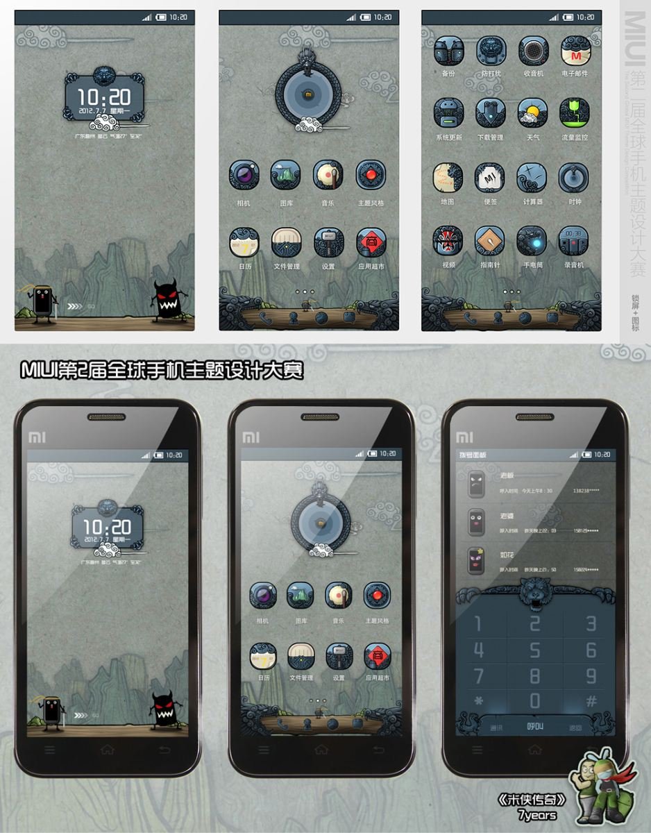
7years的《米侠传奇》 http://www.zcool.com.cn/work/ZMTM5MDkwMA==.html
水墨色的中国山水世界里,诞生了能够打败其他群机的米侠~~
于是我们得以在小米侠的江湖世界里领略畅游古典之美
@7YEARS 又是一套好有爱的作品呀!!
话说这位设计师太神了!!他已经整整为大家做了4套这么美的主题设计了!!
评委(Andy Ogden)微点评
1.第一印象
这款主题在手机日常应用中加入了卡通冒险游戏的风味。我喜欢卡通世界的颜色和质地。智能手机屏幕后精巧的数字卡通,与传统符号形成强烈对比,给人一种妙趣横生的体验。蓝灰色很酷,让我不禁想起中国古代的灰色石头,和我在中国见到的云迷雾锁的天空,颇有中国水墨画之风。小恶魔是引人注目的焦点。多么希望我能看懂汉语,这样就更能理解这个人物。我不知道这个传说的来龙去脉,也不了解偏暗的色调如何与小米的品牌契合……但我喜欢有背景故事的创意。
2.优点
图标与背景界限明显,清晰可辨。我喜欢这个创意,人物是小小的表情符号,就像是生活中各种各样的人,每个人物都有自己的态度。中国传统元素的卡通风格,与手机现代高科技的一面形成了有趣的对比。
3. 可改进之处
卡通风格的一致性还是超越了比手机的可用性。图标设计得都很有趣,但是需要花点功夫才能看得明白,区分得开。这界面很专业,只有理解了所有符号的意义,才可能轻松驾驭。如果是对界面不熟悉的人,弄明白这些符号的意思就比较困难了。相比美国人,中国人可能更容易明白。有时候,手机主题会给我带来意外惊喜,但是我不太确定,我可不可以一直用这个主题。小米手机的屏幕很大,但我还是有点担心,这个主题图标的细节可能无法一览无余。
4. 结语
整个设计创意很有趣。我建议你在注重视觉效果的同时,再加强一下图标的易识别性,找到二者之间的平衡。
附:评委点评英文原文
1. first impressions
This idea takes the daily use of the phone into the flavor of a cartoon adventure game. I like the color and texture of the very cartoon world. buildings. The slick digital cartoon behind smartphone glass is an ironic contrast to the traditional symbology and analog first impression of the cartoon. There is a “ fun and humorous” feel to the experience.
The cool blue grey color reminds me of the grey stone in old chinese and pleasant overcast skies I have seen in China and in the colors in traditional painting styles. The little demonic character is the center of attention. I wish I could read Chinese and understand more about this character. I don’t know how the legend goes or how this fits with MI’s brand- looks a bit dark. …. but I like the idea of a backstory.
2. aspects of design that working well.
Clear separation of the icons from the background. Very legible. I like the idea of little emoticon characters and being able to see the state of others in my social network.The character clearly has attitude. the cartoon stylization of traditional Chinese elements creates an interesting contrast to the modern and tech aspects of the physical phone.
3.aspects that can be improved
The consistent style of the cartoon universe is finally more important than being able to use the phone. icons are each intended to be an interesting experience but take a bit of work to understand and quickly differentiate from others. This is an expert interface- meaning an expert who understands all of the symbols might navigate easily. But it means someone new to the interface will have a harder time finding their way around and has to learn the messages and meaning in each symbol. This may work much better in Chinese Culture than in American Culture. I am interested in the idea that sometimes my phone could take me to such a place but am not sure I want this to be how my phone is most of the time. The MI phone has a great screen but I expect many of the traditional etching scale details in the icons will have difficulty to be seen.
4. statement of encouragement
This idea is very intriguing and I would recommend that you find a balance between the visual styling and further developing the symbols and navigation of the interface
评委(Shelley Short)微点评
1. 第一印象
• 有趣
• 风格令人着迷,与众不同
• 很有潜力
2. 优点
该设计运用了与众不同的风格,在中国的悠久历史中融入了现代色彩和强烈的冒险感。我很想探索这个小小的世界。
该设计2D细节丰富,图标分布均衡,分层技术娴熟,创造出丰富的3D环境。
人物生动,有活力,增强了用户体验。(不过小恶魔不要发脾气哦,这样才会吸引更多的年轻用户!)
3. 可改进之处
虽然图标很有美感,但可识别性有待提高。
底部最常用到的几个重要图标,从截图上看来,太屈从于人物性格。单纯作为动画来说很酷,但是考虑到手机的功能性,这些图标需要有更大的差异性。
4. 结语
该设计采用冒险游戏呈现,图标结构丰富,充分表现了MIUI用户和品牌的特点。此外,如果每天都播出这个人物的微短剧,一定能更加拉近MIUI与用户之间的距离。总之,做得很棒!
附:评委点评英文原文
1.first impression
•fun
•crazy,great distinctive style
•growth potential
2.successful design aspects
• The legend of mi captured and executed a cool distinctive style that honors a deep history of chinese design with both a modern twist and strong sense of adventure. This is a micro-world I would love to explore.
• The design effectively blends a 2D richly detailed and proportioned icon set with skillful layering techniques to create a rich 3D environment.
• The characters have a vitality to augment the user’s experience. (but please use nice language- this design will attract young audiences!
3.focus for improvement
While the aesthetic of the icons is well executed, there is some room for improvement to their legibility.
The key icons at the bottom which are most frequently used, are (in this screen shot) too subservient to the character action. This can be cool for a launch animation sequence, but when the functionality of the phone needs to take over, they need more distinctiveness.
4.encouragement
This design uses an adventure game language and texturally rich icon set that offers a very strong identity for Miui customers and the brand. In addition, the potential for strong customer-miui relationship if micro drama episodes of the characters are broadcast daily. This could be a game changer- great work.
本文标签: GUI设计, 图标, 手机主题, 界面, 设计师