

评委(Andy Ogden)微点评
1. 第一印象
背景是饱和的互补色,犹如北京氤氲的落日,营造了素净朦胧的氛围,晶莹剔透的卡通图标漂浮其中,鳞次栉比。图标清新中透着梦幻,与远方的天空形成对比,创造出空中透视和3D立体效果。图标很友好,合成感强,同时又庄重直接。它们遵循整体规则,却又坚持与众不同。乍一看图标位置整齐有序,严格遵守排列规则,但是仔细再看,你会发现图标边缘并不是直线,而是起伏的波浪线,就好像被吸管吸进去了。很显然,该设计的统一性合成感较强。
2. 优点
此设计外观新颖,同时与硬件也非常协调。图标调色板干净清爽,很有质感。视觉符号识别度高,尤其是那些看起来像小巧的黑色手机屏幕的,或是边缘有框的图标。长条按钮看起来像是可以改变颜色和亮度。我能想象,背景犹如变幻多端的世界,随着时间和天气而改变,或可以与用户选择的地点同步。
3.可改进之处
起伏的边缘让图标显得与众不同,但同时也让图标不那么有力、明朗和纯粹,这似乎与手机的形式语言相悖。我们习惯于小玻璃泡从内向外的张力,小米手机就有这种不可思议的力量。起伏的图标边缘与此相矛盾,让人下意识地感觉不舒服。微妙的变化削弱了图标的浮动感和视野深度。背景颜色可以稍微去饱和,或者随时间而改变。手机后盖的设计似乎与整体设计风格不太一致。建议强化在手机里创造出失重世界的设计理念。
4. 结语
总体来说,此作品令人印象深刻,稍作调整即可成为非常实用的设计,可跨多种语言和文化使用。希望作者再接再厉,多听用户的反馈,尽力去了解用户想要却难以表达的东西。
附:评委点评英文原文
1. First impressions
The saturated complementary colors from a smoggy LA ( Beijing?) sunset make a sweet and neutral out of focus background atmosphere for shiny little glass cartoon capsules that are floating in a uniform pattern. The crisp surreal focal definition of the icons contrasts with our perception of a distant sky creating atmospheric perspective and a sense of 3D depth.The icons are friendly and synthetic but also essentially serious and straight forward. The icons follow their own group rules but insist on being different from norms- they are on edge. They are at first ordered and follow strict and organized rules in their position but on closer inspection their bounds which look straight at first are really undulating curves- that seem to pull edges inward as if by suction. The consistency of the controlled form is clearly synthetic.
2. Aspects of design that working well.This design has a novel look and at the same time feels in keeping with the physicality of the hardware. The color palette of the icons feel clean and fresh. Very solid and of quality. The visual symbols read rapidly – especially those that look like small phone screens with a black or otherwise have a frame frame on the edge. long bar buttons effectively look like they change color and illumination. I can imagine the background atmosphere being a world that changes with it’s own time and weather or synchronizing with places the user selects.
while the undulating icon edge is different it keeps the icons from being strong, clear familiar and solid. This part seems to contradict the form language of the physical phone. We are used to seeing small glass bubbles that have a pressure from within that pushes outward. The Mi phone has this subtle tension pushing the form outward from within. The undulating edge contradicts this and creates a subconscious discomfort. The subtle amount of change distracts from the more valuable sense of floating and depth of visual field. The color in the background could be desaturated slightly – or change over time.- And the back of the phone seems out of place with the rest of the design. It is not consistent in style (which is not what I would recommend )I would recommend something that reinforces the idea that there is a different no gravity world inside the phone.
4. Statement of encouragement
Overall this is an impressive proposal and with a few tweaks here and there could be the basis of a very versatile interface that is useful across different cultures and languages. Keep up the good work…. get feedback from lots of people (endusers) and try to listen for what people want but can not really articulate.
评委(Shelley Short)微点评
1. 第一印象
·给人一种微妙而宁静的感觉
·色彩丰富的审美体验
·简洁、现代、功能性强的设计
2. 优点
·该设计体现了清新明快的设计美学,表现了手机平面设计的基本要素:干扰最小化。
·图标具有很好的识别性、区别度和对比度,融合了功能性和美学性,整体比例也不错。
·渐变的运用,颜色精美,图标处理技术娴熟。
3. 可改进之处
·要改进这个设计,可以采取为用户提供同等美学选择的办法。通过手机,可以建立起独特的用户关系,我们再用简单明了的办法帮用户创建微妙的身份特征,可谓锦上添花。
·这个建议适用于登陆页面或与类似的简单功能页,比如音乐界面,并不适合主菜单或者多按钮界面。
4. 结语
·该设计给人一种很舒服的感觉,精美、简单、实用,让MIUI用户可以在纷繁复杂的生活中有一片井然有序的小小净土。以后改进此设计时,请相信自己的审美,这个作品潜力无限。
附评委点评英文原文:
First impression
•subtle and peaceful feeling
•colorful aesthetic2 % x i1 i6 S2 h3 u
•clean. modern. highly functional design
Successful design aspects
•This design embodies a clear, crisp design aesthetic.and addresses a fundamental tenant for mobile graphic design : distraction minimization.
•Ambilight has good icon legibility, distinction and contrast and blends high functionality with an aesthetic flare. It has a nice sense of proportion overall as well.
•This design solution uses the subtlties of color, gradations and slick icon execution as it’s identity which could offer a retreat for many of Miui customers.
•Ambilight could be improved by offering an equally aesthetic option for personalization. Phones hold a unique device/customer relationship and offering a clean and non cluttered method for helping people create their own subtle identity could be an exciting addition.
•This might be used on the landing screen or similarly simple function pages- very similar to the music page example. This suggestion is not recommended for the main menu or screens with many buttons/multiple functionality decision points.
•Ambilight design feels comfortable because it uses subtlties and simplicity and constrains its design in the service of functionality and could offer Miui customers a miniature well organized oasis in their very complex lives. Trust your aesthetic sensibilities as you evolve this design it has solid potential.
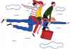
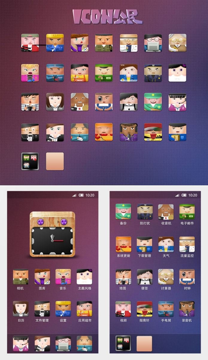
热可乐的《Icon公民》 http://www.zcool.com.cn/work/ZMTM4OTMwOA==.html
他们都是Icon,他们又都是Icon国里的公民~
每个人都是扮演着自己的角色,在我们的MIUI系统里各司其职
摄影师代表着“相机”,邮差先生是“电子邮件”,摇滚歌手是“音乐”!!
哈哈,你能想象得到吗?不得不佩服作者天才的想象力了!
快来一起领略Icon世界里的人情世故吧~
本文标签: GUI设计, 图标, 手机主题, 界面, 设计师